Sunday 30 October 2016

Telling Tales Production Diary Week 4

Monday - On Monday we put together the animatic. I put the second half together which included the chicken sequence onwards while my partner focused on the earlier sequences. After they had been put together i handed it over to my partner to alter the animatic where needed for the comedy to work as well as sound as they have a better grasp on comedy.
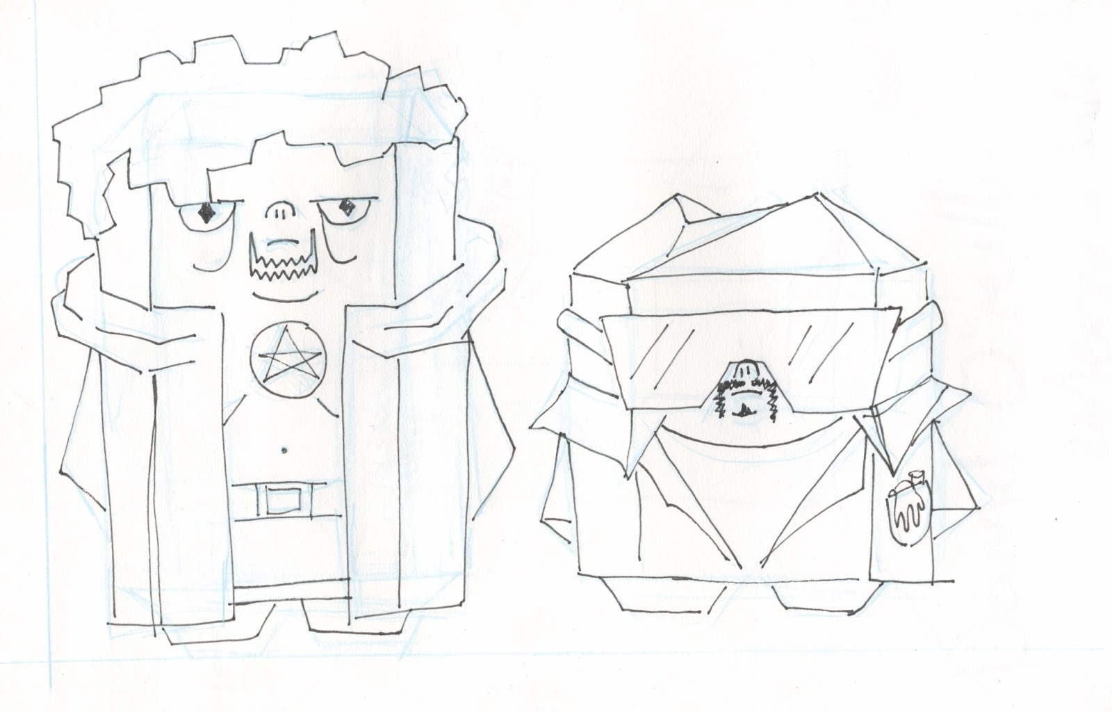
While my partner worked on the animatic i made a refined version of my character. He was given a robe that went over his shoulders revealing his entire body and the mesh shirt and pentagram. We removed his scraggly facial hair as it was too much details on the face but removing it didn't detract from making his age visible with the extra lines in his face.
As well as my character finalisation i also worked on the overall designs of the brothers room refining the drawings that both of us had done to come up with a floor plan and a layout of each sides wall.
The idea was to mirror the rooms but also to make them starkly different although their personalities and goals are almost exactly alike. As the wizard was the room i originally researched i found it a lot easier to come up with tat to fill the shelves and general look of his side combining his occult obsession with his LARPing stuff. With the scientist it was a bit harder as i hadn't done the bulk of the research and his stuff looked more serious except for his fridge and step ladder, so again to get the  visual comedy down my partner will look into what could be improved. i also quickly drew up the portrait but id like to rethink all of that as it was done very abruptly.


Tuesday - We had an intern crit today and we presented the story, characters and set to our peers. We got critique on our scientists design and how it needs to be altered to look more pathetic than cool as well as consideration to the story and how certain elements and the idea of a rule of three in comedy could be put in place to better execute the idea and comedy. Something with the characters is that they don't look like brothers there are no biological similarities to the designs (hair colour skin colour). So while they look like they belong in the same universe they don't look like family. We agreed that we would give them turquoise coloured skin same as our preferred scientist colour scheme.

While my partner developed the design of the scientist further i went onto doing the colour scheme for the occultist. Based on what i had considered before i didn't need to do too many variants to find what looked right; generally darker clothes with bright hair and skin with the skin being the same turquoise green as the scientist to make them appear more as brothers.
My partner wasn't a fan of the coloured eyes and i thought purple was too dark so i tried for a red that could be seen as blood red. This worked really nicely as it created a nice contrast with the turquoise green of the skin. Even though the robe isn't dark coloured the red still works because it isn't overly bright like the skin you could almost say it brings the colour out in his face, with the removal of eye colour this meant my character was made up of two colours, red and green, which I'm a little frustrated by as i felt like he could of been a bit wackier, but when we did wacky it doesn't get his character across. We avoided black for the clothes even though they were occultists robes because black when used causes things to get lost in the imagery because its such a strong colour.


Thursday - I worked on making a character sheet with expressions and a front back and side view. Due to the style and design of my character i didn't do a 3/4 view shot as i felt it unnecessary because it would be a confusing image with an unclear depth perception and when modelling this character i will be working in a front and side view primarily. The expressions were interesting to come up with. My character would never of been happy for a good reason so his positive emotions are mockery and scheming. Trying to draw the overall expression but keeping the design in tact was hard as his most prominent facial feature is his fairly lifeless and dead eyes so getting them to suddenly portray emotion was difficult. I got around it by adding two little 'eyebrows' to him, these gave more flexibility for his expressions.

At this point i am pretty much complete with preproduction so i began using the tutorials on maya to model a character. I plan to make the tutorial character first in order to get to grips with the software and the tools while taking notes.

Telling Tales Production Diary Week 3

Sunday/Monday - Storyboards, neats. Having gone through and finalized our story idea i took the role of neatening up our storyboards so that they were more clearer and explained the scenes/ situations an what was going to happen in the story.
The first few shots are establishing shots that show the interests of the characters, trying to get their dorky personalities across using their rooms as well as focusing on the visual comedy aspect of their room. The third and fourth shots further cement their differences and their hate for one another with the room divided down the middle. The final shots showcase their personalities, showing how they care not for their mother in the photo and are solely focused on themselves, I like these shots because with out the characters saying anything we have been able to introduce them and their characters.
Now the series of events that lead to their eventual downfall begins. It starts with the Wizard Brother (W) crossing the line and drawing a magic circle angering the scientist (S), so in response S tries to get back at him bye throwing something of his over as he is petty and hates backing down. While this is happening W picks up a chicken to sacrifice so that we establish early on where he gets the chicken later. We follow S over to his side of the room where he picks up a flask off his desk.
The look of the animation goes really detailed similar to the overly detailed images in sponge bob as the camera gets closer to his mouth as he tries to drink it to build up suspense to something big happening but is then stopped by an abrupt SLICE sound which makes him jump and when he turns around the camera zooms around stopping on W. He is holding a chicken head with falls off and bounces and rolls like a penny then squawks violently even though its beheaded.
W Throws the dismembered body into the air and it hits S in the face as he flies off This prompts the two of them to get really angry and approach one another stepping into the previously made magic circle. The chicken continues to fly around the room knocking things over while the magic circle lights up. The chicken hits the light in the middle of the room and drops to the floor, finally dead.
The brothers stop arguing and look down with blank expressions at the chicken corpse. The circle and room is engulfed in light and when it clears they have become an immovable blob. then a time transition happens and the poster falls off showing the painting, so they gained immortality but could do nothing with it.

Clothes design - Something that my partner picked up on was that my character didn't have anything that was funny to look at while theirs has a t-shirt with a stupid science joke on it so i let them have free rein over the clothes design for my character to try and come up with something different.They looked at more Larp clothing and created a lot of variants, but the key point we noted was that the ones with hoods looked better than the ones with hats so we moved away from the pointed wizard hat to the idea of him wearing robes, so i took the centre design further with the help of my partner.
My partner really wanted nipples out with an open shirt but it was a bit awkward to position so i settled on drawing moobs for the visual comedy. It was all for making him seem as dorky and uneducated as his brother. when my partner was looking at LARP gear there was a lot of mesh clothing so they felt the characters clothes needed to look borderline wrong so cross hatch drawstrings over the chest and belly.

                                     
Tuesday - With the newly refined design i went about adding colour. However i didn't really have anything to go off of so i initially started with very drab colours similar to the LARPing gear. but this made him very boring and when i showed the palettes to people they said nothing really stood out.
As nothing stood out i tried to make the general colour and hue much brighter overall but muted a few others as well as tried secondary colours. For the most part they looked better but were still fairly dull and were also very reminiscent of Link from legend of zelda in a few of them. But again nothing jumped out.

Wednesday - After showing my colour palettes to my partner They agreed it was still very drab and boring. We came to the conclusion that this was because of the overall shape which was very boxy because of the robe but we didn't want to go back to the wizard hat. We tried comparing the characters and my partners character was very much broken up by hair and clothing so that it wasn't so boxed in. So we tried redesigning him with hair similar to my own to break up the shape and had the hood down. We also went with an open jacket showing a bare chest to try and get his douchey character across. As a character it was a better fit fro him to be an occultist rather than a wizard as it didn't come across as obvious as wizards don't actually exist but you do get occultists, this made it a lot easier to come up with a new design for him using something based in reality.
Thursday - With the colour palettes for the new design i went off of how my partner had done their colour palettes and didn't restrict myself to natural skin colours even adding colour to the eyes. As i went along i felt dark robes were needed but the skin could be really ridiculous in comparison. Keeping the mesh idea in the form of a shirt with a bulging stomach and a pentagram and robe we felt this made him look like an occultist.
Friday - However when talking to people and showing the designs it was brought to our attention that the character didn't quite make sense. In the fact that it didn't get his personality across and the hair didn't make sense either. He didn't look like an occultist with it, nor did he look particularly like someone who thought what he was doing was cool so it was back to the drawing board. I tried a few hairstyle variants but they didn't fit onto his head in the right way. The best we found was a bowl cut which made it seem like he got his hair cut at home so another shut in element from the whole still living with their mum. But we decided to give that haircut to my partners character as mine had a few other possibilities. One being a fedora the coolest of the uncool hats but also a trench coat with that as well. These got his personality across but not his occultist obsession so we also came up with the eye make up and kept the mesh shirt and pentagram but these features didn't match with the fedora and coat.


Sunday - Taking the different ideas for his outfits i separated the idea for the hat and trench coat from the mesh shirt and robe so that the design didn't look like a mess. The fedora and trench coat designs were becoming too boxy again and they didn't show his occultist obsession. But with the robes and mesh shirt i was able to break up the boxy shape and make him look very stupid. I showed the design to a class mate who didn't know what his personality or interests were and he described the designs as a person whose a beginner, wannabe occultist, like he doesn't know what he's doing which was great as thats exactly the personality of this character.


Wednesday 19 October 2016

Telling Tales Production Diary Week 2

Monday - Myself and my partner came together to discuss the storyboards that we had independantly come up with and worked to see what we could pool together. We came up with the establishing scene of the mother bringing the boys a package to their room and them bickering in order to establish their relationship to the audience. However we were struggling to get the catalyst for what causes them to find immortality. My partner really likes the idea that they find immortality but at the result of them becoming a blob that cant move and time passes around them. Currently I'm not entirely sold on this idea because i didnt know how we'd get to this point.
Tuesday - I began drawing out character designs based off of my mood board for the wizard. These first drawings were really lackluster in design as there was nothing that made them jump out and make them interesting. I chose to focus on the rounder but longer shapes to emphasize the dorky character he embodies as it was the only design element i liked.
 While developing the shape and design i thought about characters that wore pointed hats and robes but were simple and 'Over the Garden Wall' came to mind. Mainly Wirt's clothing with the red hat and cloak. This made the character skinnier than we originally planned but we came up with a nice contrast between having a really tall brother and a much shorter brother, similar to over the garden wall. We wanted them to have contrasting but similar shapes as well so my partner designed her character as if it was an onion and i designed it like a corn on the cob. These later designs have so much more character than the previous ones and they really encompass the personality traits of him; Petty, Narcissistic, Ignorant of himself and the world around him. Right now he also looks too young, him and his brother are 33 and 35 respectively so they need to look older.

 Wednesday - While i liked yesterdays designs i started to think about how we would actually translate this into maya while keeping it simple and easy to model. So i started to draw it out as a low poly character made of squares. We had agreed on a low poly maya model so that it would render faster and would be easier to model as neither of us have modelled a character before. for inspiration on how to present our characters design we looked at Pixel Pit, a youtube animator who uses a blocky, janky, stop-motionesque style on maya. This helped to come up with much more square and stunted bodies which we both really liked but we want to try and design them inn a way that isn't just ripping off Pixel Pits animation style. Because i was struggling to visualise what this cuboid shape would look like i opened up maya and started to play around with the software to get an appealing cuboid shape. I created a shape that used cut off corners and an elevated top and bottom this helped me to understand what shape we were working with.
 Thursday - Since we had an idea of the body shape we started to design the characters in more detail with this shape in mind because of the blocky shape we were using i decided to cut the top of his wizard hat as i was struggling how to comprehend how to make a point, this does make him look a lot more like a American settler or witch hunter. With the comparison of mine and my partners designs we agreed that my character should be the taller of the two giving the other brother a complex over how short he is going off of the brothers mutual distain towards each other. We also talked about What the face of our characters should look like as we are applying 2D assets to them. The initial sketches were very cute and not what we were looking for, my partner felt they needed to be uglier which i agreed with, we needed to be able to get across these were two sad little men. We gave them neck beards and double chins, works well at making them look stupid as well as slightly dead inside.

Our tutor came around and talked to us about where we were going with our project and explained how we weren't getting very far with a narrative with no clear finish or how our storyboard develops. We were struggling to figure out our catalyst for the ensuing chaos and we were too focused on the idea that they were in their mothers basement especially if we were going to some how show the centuries passing once they're merged together. So we changed it to something more akin to a garage with windows showing the outside and as the world gradually changes with the centuries. Also instead of a goat we changed it to a chicken as while the goat is associated with the devil chickens get sacrificed more often we felt. This lead to the idea that the catalyst for the chaos was 'running around like a headless chicken' literally! the wizard would sacrifice the chicken but it would remain alive and fly around the room causing mayhem. We made the chicken a simple round shape so that we could model it easily and quickly.
Finally, as we felt we were on a roll we created a rough story board from posted notes. The rough overview of the story is that the brothers are trying to become immortal for a competition, one through magic the other through science and they hate each other so the room is split with a no crossing policy. But the wizard draws a magic circle over the line which leads to a series of event that results in the circle activating and the two of them fusing into an immortal being.


Monday 10 October 2016

Telling Tales Production Diary Week 1

Tuesday - For this brief I really wanted to work collaboratively, as it would be a great opportunity to see the same project from someone elses view point and to start understanding what working in a studio would be like as well as being able to pool together the best of ideas to make something better than what either of us could do alone. I wanted to work in stop motion as it was something i had never done before but the person i partnered with wanted to try working with mixed media or hybrid animation which i found interesting so i was willing to not do stop motion and save it for another project.
We looked over the nine titles to work from and chose our two favourites to focus on; Adrift and Road to nowhere. With Adrift we focused very simply on the sea aspect of it while with Road to Nowhere we were a lot more broad with the idea until the idea of 'nothing to do in eternity' the idea that eternity or immortality results in being alone with no one that knows you and theres nothing to do. 
Afterwards I looked into these themes and our focuses looking at the lores and myths behind them to help come up with a catalyst for our story, something that could bring about more focused ideas.
Wednesday - We came together to go over our ideas. My partner really liked the idea of two people competing to try and become immortal before the other. They came up with the idea of two brothers attempting immortality but there methods are polar opposites, one makes use of science and the other magic but neither is working for them. So we started to come up with what these brothers were like as characters and felt that as things weren't going well for them they should be very dorky, nerdy and awkward. One thing that we needed to make sure we got across was that they were attempting immortality, we found a quote by Joseph Heller- 'He had decided to live forever or die in the attempt' It gets across what the brothers are trying to do and adds context as well as makes their situation more humours when a priorly perceived pretentious quote is used to encapsulate their situation.
We also went about finding information on the different methods of gaining immortality in the respective fields we were focusing on, i was looking into the magic side of it. I also recorded the runic alphabet as magic circles make use of them.

Thursday - To make sure our work was finished in time we made a schedule. We planned it so that by the final week all our work should be done or near completion.
Friday - We both began to come up with story ideas with the dispute and immortality between the brothers. Afterwards we will come together next week and take from each others ideas and storyboards that we like. Collectively today we like the idea that the end results for their immortality is that they are no longer human.

Saturday - Further storyboarding. With all these storyboards that show the establishing shot i wanted to try and show their characters with their room so we understand what sad little lives they lead.