Saturday, 27 February 2016

Visual Langauge - Form, Flow and Force, Motion Drawings


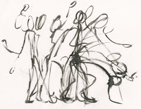
This first task was made up of drawings of people as they did movement and actions these were ten seconds long as the person paused in each moment of the action.


The Above drawings were done following a section by section basis. Drawing the action step by step into the boxes (roughly). however this didn't show the motion as well as hoped the actions became disjointed and didn't make so much sense.
After the first set of drawings i decided to draw in a less restrictive manner so that the drawings were drawn one on top of another following the path of the person as they acted out the action, these looked a lot nicer as they had a much more fluid motion and action. I found these to be better for references for movement than the prior drawings.

Wednesday, 24 February 2016

Visual Langauge - Form, Flow and Force, Life Modelling

Now this doesn't mean nude.

We were given our final Visual Language task which was observations of people and drawing motion and action. We are set 4 different tasks within this project, they are;

Motion drawings, 10 seconds a piece, with a minimum of 12 drawings showing a consecutive action. I like the sound of these as i have done observational drawings of people moving before so I'm ready to expect really rough and quick lines.

A2 drawings done in roughly 20seconds, 12 poses, showing a moment which presents rhythm and flow. similar to above but ill focus on the point of weight, line of action as well as lighting and shadows.

5-10min long drawings of a pushing and pulling action, minimum of 4 looking at the arcs and weight being put on the model. a certain level of detail will be in these ones but i think there'll also be some lines to show weight.

4 poses of any choice with 20-30minutes to draw allowing time to work on the proportions, perspective, foreshortening, shading and any other details. Clothed life modelling basically.

Maya Induction - Lorry/Truck

With the knowledge learned from the initial Maya tutorial we were set the task to create a lorry/truck using the simple shapes and techniques taught.
as you can see my lorry is very much fisher price in design. i didn't want to spend too much time on it at all really however i worked with adding extra vectors, faces and points in order to create the slightly more accurate representation of the lorry. Looking at it its more of a truck as i fitted a back to it that has sides for protection to hold items so its more of a truck, i think adding that was my own attempt at being creative with this task. In the future i do want to go back and work back into it as well as improve or even completely redo it so that its at a more acceptable standard.

Sunday, 21 February 2016

Applied Animation - Character Mood Board, Saphira i.e Dragons

From Eragon one the main characters is a Dragon. So i looked at artist representations as well as real life lizards to see what they could possibly look like. As this is just an initial mood board i didn't focus on a specific aspect but just the idea of what a dragon is.

Saturday, 20 February 2016

Modelling Workshop - Final Model

I was able to finish off the model finally. it was quite difficult to add the hood, sleeves and back of the robe. However the sleeves were the easiest of the lot but a little tight to wrap round, the stiching on the entire thing is very rough. 

The hood was the most difficult to do as i had to attach it to the base material, but keeping the hood up and high was very awkward, i also wished that it covered the head a little more but because the material isn't sturdy its very loose and looks very bulky.

The robe was fun to make as it made him as character look so much more lordly and powerful. with the hood and the robe i had to use pins to hold it in place as i couldn't stitch into the material of the clothes as they were already being worn.

Friday, 19 February 2016

Sequence, Series, Set - Spiderman, Spider Island

Urgh. Spider Island is horrible. Its a story focusing around the spiderman franchise, (obviously) where a character, the spider queen has turned all the residents of the city into her monstrous minions. terrifying spider humans with huge eyes and extra arms covered in hair and stretched skin (Boik! i feel slightly sick).

That being said it was really interesting to look at all the varieties of humans being born into spiders. It really fitted with my idea of humans producing spiders, definitely working with a more terror aspect than anything it created very disconcerting images.

Sequence, Series, Set - Jorogumo

The Jorogumo is a mister from Japanese myth. its a huge monstrous spider which can take on the form of a seductive woman. The jorogumos would use this form to entice wandering men and devour them. I chose to make a half woman half spider as they had a really interesting look. in pop culture they're very seductive creatures with the top half of a woman and the lower half of a spider, but with most of my images of them i wanted them to be either suffering from the transformation or be perceived as monsters with no intention of sexualization or seductivness to them, (yes they are half naked but lets be honest they're monsters they aren't to bothered by clothes).

The Jorogumo design has been used in various modern designs; the Racnoss from Dr Who, Cydaea, the Maiden of Lust from Diablo 3 and even Hellboy has fought one.

Sequence,series, set - Hercules, Character Design Meg


When i started to draw out my storyboards i wanted to draw them in the style to the left, a very curvaceous and angular clean style. When i drew the image it made me think of the design for Meg from Hercules. She had these aspects added with a stylised greek twist which looked really unique for disney styles. So when drawing my storyboards i worked with the same sort of style with curls and waves in the lines.

Unfortunatley the characters did look very similar, but id say it was they were supposed to be stylised, beautiful greek women and i hadn't actually done any character design for the story board so i wasn't able to accentuate any differences between the two characters.

On a side note i really like the fact that megs body shape was designed around greek vases, it fits so perfectly!

Thursday, 18 February 2016

Maya Induction 1

Our other studio brief was an introduction into maya, the 3D animating and creation software.
In our first induction we were shown only a few of the many features of maya.

This is what greeted us a dash board full of icons i didn't know where to start, i didn't even know how to move the screen around. When we created the first shapes i tried using the circle to make a head shape because the circle had a lot of points to pull to reshape. But I was told that starting with a circle gives too many points to work with so to start with a square and add sides and edges to it.


So i went back to a square and started to pull and stretch it, adding faces, points and vectors to drag and create various shapes with an overall vase like design even making it dip inside itself to be like an actual vase. I actually really enjoyed working like this, i was a little apprehensive at first as i was bombarded with a lot of things i didn't understand but i felt i was really starting to get to grips with what i was shown. Another feature, to make shapes more natural and smooth there was also a smooth button that curves everything making it less rigid and blocky.

Wednesday, 17 February 2016

You Spin Me Right Round - Digital Turn Around

I wanted to redo my turn around in digital to make it neater as well as fix the issue that occurred with the hand which jutted back to centre on the final frame.

The digital turn around was a lot clearer but still a little jerky in places and the smokes direction didn't really make sense i felt but i was very happy to see a much neater and tidied version. To fix my issue with the hand, i drew it in its original place then used the lasso tool to move the two frames worth along. this fixed my problem, the only problem in the end i felt was the smoke as it really fluxuated.

Friday, 12 February 2016

Applied Animation - Possible Titles

For the titles brief i need to choose a book to make a title sequence for however i am a slow reader and i don't read much other than manga so i had to rack my brains to come up with something that hadn't already been prior made into a feature and after some thinking i came up with three possibilities that i could consider.

The first was the comic series bone. While i didn't want to work with a comic series as i felt i would need to work with the style, i find the story of Bone to be interesting the exploits of bone and his friends , their mishaps and adventures with fun humour coupled with every aspect of an exciting adventure with something much bigger than themselves hanging over the top of them.

Bones character designs really vary with a wide variety of shapes and sizes in them but a consistency seems to be there however. Theres bone and his species, the rat creatures as well as humans meaning theres a wide variety to work with.


the second was Eragon, a fantasy epic which will include fast paced and grand battles, wars and duels on the backs of dragons and other fantasy creatures. I haven't read it in a long time so my memory of it is fuzzy, meaning i would have to reread it which will take time as i am a slow reader.

Eragon has previously already been made into a very badly rated movie (16% on Rotten Tomatoes) so i think it will be good to make an opening that would actually be pleasing and entertaining as well as exciting.


The third book i came up with was Assassins Creed Renaissance. It is one of the books from the assassins creed (AC) series which was originally a game series by ubisoft. I have played AC 4 and parts of the second and it is a gam series i really enjoyed so i have some knowledge along with the urge to read the book.

I don't know the story but i can definitely say its action packed as a series with gradual suspense because of the assassinations as well as political moments which would be an interesting chance to introduce characters of the series, however i have never prior read it so i don't think ill use it though.


The book I'm using, i decided, is Eragon. It was between either this or Bone, my reason for choosing it was while Bone would of been a lot faster to read through as a graphic novel i wouldn't of had the chance to work on character design like with Eragon. My plan for documenting Eragon is to with a lot of posted notes i would note down events, character descriptions and sceneries from the book.

Thursday, 11 February 2016

Sequence, Series, Set - Greek Pottery

As my storyboards focus was of a greek story i decided to look into the sequential imagery of that era, which did exist, it was just in the form of pots and vases. The greeks would create something called black figure pottery which is the most commonly thought of greek pottery and its with this pottery that stories are told. these are all the greek legends as well as unknown stories these can be presented as if they could appear like a comic strip or like a zoetrope where it would be a gradual change of the same image just like animation.

Modelling Workshop - Wood

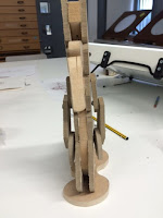
The other workshop we had was a wood work shop creating our character using the tools in the studio. We were shown all the machinery and methods to create our characters. I wasn't happy with this model for multiple reasons; overall i think it looks boring in comparison to everything else I've made and i wasn't happy with it being so flat as well. It all has a design/feel of poorly made the joints aren't strong so one arm swings wildly while the other can barely move, his moving beak looks very strange due to its shape and design and i was really disappointed that the mist became a podium for him to be placed and not a part of him.

Modelling Workshop - Plasticine

After we completed our character design we were required to create an armature and model, similar to what they create for stop motion however this model wasn't required for us to move it to such extreme extents, so we didn't have to worry about walk cycles of the sort.

To start we needed to have an understanding of how the body of the armature would be like so i redrew the rough t-pose of my character again. afterwards i drew in how i was going to stabilise it and give it moving limbs. Something that had been bothering me was how i was going to achieve this. I considered material, the idea of CGI or making it out of the plasticine which is what i chose to do in the end as it was the only possibility and the most convenient at the time. I also wanted to make the beak move because it was such a prominent part of his design so i figured out how the beak would be connected to the head in a way that wouldn't cause the plasticine to break or that halts the movement of the beak. I succeeded this by connecting the beak in two places, parallel of each other causing the beak to move up and down, but i didn't connect the top rim of the beak as it would restrict its movement .

Started the armature making, we had two types of wire to work with, a more heavy less flexible wire and a more flexible but less durable wire. I used mostly the less durable wire by wrapping to pieces of it together to get the flexibility but with some sense of security, this was used mostly on the limbs while the core body is made using the thicker wire so that he had a sturdy structure below.

So that the armature could stand i gave him legs which would eventually get covered any way by the plasticine and clothes. Along with this we had to bulk out the characters in places where it was needed however my character had a very skinny and meek design so i decided to just add some width to his chest area, but just barely so the plasticine had something to cling to.

Having wrapped the wires in bandage tape and masking tape so the plasticine wouldn't fall off i started applying the mist and bone to him. the mist was especially difficult as i had to think of a way to make it look fluid. Initially i wrapped it around the body in strips, this gave a nice effect when it came to the ripples, but it used too much in one place as well as being very bulky so i took it off and made multiple round plasticine balls. I cut these in half and stretched them out to make larger ones set around the base of my character. I then proceeded to smooth them together, trying to get smooth transitions between each one as well as adding small flicks a top of the smoke to try and emphasise that its smoke and not a dress. His 'bone' was a lot easier to do as it just had to be moulded around the armature, i had to take great caution with the beak and the plasticine is quite thin there. I tried to add extra little details like bone definition, however i don't think it looks very good, it looks very tacked on and naff.


I chose to make his clothing out of cloth instead of plasticine as it is a robe with a very interesting design so it needs to be more natural or to try and fit the original medium. I had spare purple material for the lining but i had to stain some pale old scraps for the black material, that was a lot of messy ink!

His staff was also carved in the wood work shop as i was using more accurate materials i wanted to work with the correct respective materials present in the design.

Wednesday, 10 February 2016

Enviromental Storytelling - Animation Backgrounds, The Garden of Words

The Garden of Words is a beautifully animated anime movie of only 40 minutes in length. The story covers the life of a young high school student who skives off of school whenever it rains, he always goes to the park to work towards his dream of being a cobbler. While there he meets a young woman in her mid twenties and the whole film is about how they interact and how there lives are intertwined in such a small world.

The backgrounds speak for themselves on the level of talent, animation, and art that went into them, when i first watched this animation i had to question wether or not it was cinematography because of the amount of detail that went into the CGI. From the textures and the lighting it creates a world that we are drawn into because it is not only animated but it has a sense of realism, this could be in part to the setting being modern day tokyo so we can relate easily to the setting being that of a city. But even though its set in a city we see so much greenery from the park in the middle of the city and the park bench represents their own little world.

The rain is a melancholic thing as well as a joyful thing, the rain represents the two main characters connection to each other with dark gloomy days as well as summer showers showing the variety of ways they live out their lives and there emotions.

While i don't plan on making any scenery of this quality i want to try and portray the life and almost try and aim for a semirealistic style for some of my drawings as i want to be able to do what the brief is asking of us , environmental storytelling, to tell a story with these scenes, just like garden of words does.

Tuesday, 9 February 2016

Environmental Story Telling - The Leeds Library

For my first stop i wanted to go to a place that had old fashioned architecture, that wasn't a church, (drawn too many of those in the past). The Leeds Library was suggested to me, so i went to have a look. Turns out its a membership library, but thankfully the head librarian let me in.

What i saw was fantastic and exactly what i was hoping for with balconies and spiral staircases along with huge book cases. As well as modern books they had books dating all the way back to the 1400s that are written only in Latin. the whole place oozes with history and life giving it an amazing air and feel to be in.

I decided to try and do a perspective drawing from above initially walking along the balcony trying to find a good angle however i started to draw from an awkward angle, looking to the side of me so my perspective was off from the very beginning, something i had to work on. I wanted to try and draw the tops of the book cases as they are something that is not normally seen by people. to give a different view of the world.


As i felt it wasn't working well i had a look at another section of the library and decided to try a drawing that was fairly symmetrical in layout to try and consider perspective. The single point perspective looks nice but is a complete mess with zero sense of direction, i couldn't visualise where the vanishing point was because it came to a flat wall and i couldn't comprehend where it could be. I liked how i was able to see both the floor and the ceiling showing the enclosed corridor like room.


I have been working with pencil for these drawings so far as i wanted to try and do accurate (to a certain extent) observational drawings. But the image constantly becomes warped and twisted, which i could see in this image of the spiral stair case. its supposed top be a shot from below but it looks more like a level shot with the spiral dipping and losing a sense of depth which is another aspect of this brief i need to consider, depth, the foreground, mid ground and back ground. the whole image looks a feels a little squashed as if i tried to fit everything in when it would of been impossible.

While its not really easy to tell i tried to use graphite here but it just looks like a darker pencil. the perspective is still all over the place but i didn't mind too much here as it still looks appealing in the layout of the image with the tight small hall way being framed by the arch way although it looks very poor from a technical and details stand point.


Another different media, ink brush i tried to work with some sense of perspective here but more focused on getting the view from the balcony down. once again the spiral stair case went up again meaning i got the perspective wrong on its spiral and as i got tot the edges of the right side the illustration became more rough and less directed.


Terrible, terrible, terrible. Tried to do fore ground by looking through the bars on the balcony but this resulted in a very poor attempt at perspective as seen on the stair case again… (-_-) I'm gonna get it eventually. But the steps became really steep and the bars in the fore ground look fat and not angled as the small squares at the bottom of the bars were all over the place with zero consistency on their perspective.


Again i tried to draw perspective from above and it worked well on the lights but everything else became confused i kept mixing the book cases and the windows up making really off perspective on these sections. if that hadn't happen i think this would of had the best perspective out of all my drawings if i had gotten this right.


This was drawn when i went back to the library for photographs. I had a better grasp on perspective then and so tried to draw the front desk. unfortunately i didn't consider how long the section in front of me should of been so while the perspective is correct the size and placement of the desk is incorrect. I tried to include people at this point but they looked too large for the world i had drawn.


This was the final drawing i did during my times at the library and i wanted to really try to get all the little details. This was a very time consuming drawing as i wanted to get the perspective down as well. For the most part it looked alright but when i had gotten to the left side i realised my mistake. The section at the top was actually angled down slightly causing for the railing on the balcony on the left to become warped, and the decent perspective to become lost. On the details side while the lines were a little wobbly in places and the shapes inconsistent i was happy to be able to add so much detail into an observational drawing, something i had never really tried as much before, as, for me, observational drawings had always been about getting the idea of the image and not an accurate depiction, but i like these more detailed ones as well.

Visual Language - Enviromental Story Telling

This is our latest brief focusing on backgrounds and scenery. We are to draw at three different places with a minimum of 5 drawings, 2 exterior 1 interior, or vice versa. We are to consider why we have drawn there, what we might draw, how we might draw, media, lighting,shadows, tone colour, texture, shape, composition and perspective. We are also asked to consider wether or not there are some stories behind the place, all to add context to the space being drawn and to engage the audience.

I am both looking forward to this brief yet not looking forward to it as scenery is something i wish to improve upon, in all aspects, especially when it comes to composition, textures and perspective. But its because I'm not very confident in my talents in backgrounds that I'm a little apprehensive with the brief as i want to still be able to produce a high quality of work that i can feel personally proud with. I plan to take this brief as a chance to work on my skills and take them further.

Monday, 8 February 2016

Applied Animation - Mothers Basement

As i had decided to work on the Titles brief i decided to look at this youtuber 'Mothers Basement'. He is an online video reviewer who reviews and dissects anime openings. He looks into the composition and how a character is placed on a screen, how it connects to the next scene or if it is jarring to look at. If the animation is strong and fluid or if it fits with the overall feel of the anime.

I found that as i watched his videos as he explores the opening sequences he brings up points that  i hadn't considered or realised about title/opening sequences. things such as how the credits interact with the scenes and how certain opening sequences contain hidden underlying context, which is something that i would like to explore in my own opening sequence. 

It influences me to create a sequence that is compelling and appealing of its own that tells a story of its own through symbolism and metaphors, while still being connected to the story and drawing in the audience. his reviews also made me realise that when it comes to composition i haven't taken it into consideration as much as i could have in my previous projects, the characters are generally centralised and there isn't much variety on angles so i plan to consider it more now that i feel its been brought to my attention.

Applied animation - Brief

In our new module we have been given two briefs, the first is a brief that focuses on teaching us all about the features of Maya, the 3D modelling and and animating software with tasks set as the months progress.

The other brief we were given was split into three briefs that we could choose from, so we select 1 out of 3 to focus on;
The first was called Idents where we had to choose 2 out of 4 companies to make a short ten second animation, so two animations both 10 seconds, overall 20 seconds worth of animating. With each of these briefs we have to take into consideration the target audience as well as the content that is included in the show, the four companies are:
E4, Focusing on American and Adult Humour with under tones of either the strange or almost crass themes,
Disney Junior, Aimed at children and young adolescents where bright colours and enjoyment for young people are the main focus,
Hallmark Channel, a channel that showcases romances and chick flicks or shows one would associate with young and middle aged women,
The final one was national geographic where raising awareness to all peoples would be the main focus of the ident focusing on one of the different aspects of NG

I personally don't want to work to this brief as it feels quite dull and too commercial as i want to try and keep my focus on entertaining, even in this brief where we are to be informing people about things.

The second brief is called titles, where we are required to create a title/opening sequence, 30 seconds long for a book (or graphic novel) that has not already had a tv adaptation. This is an interesting brief as if we choose a comic we may have to adhere to the original art style, taking into consideration what has happened in the story, the symbolism used in the story as well as working with motion graphics, something i haven't tried yet. There is no limitation on what book to use so this gives me a lot of freedom for my genre or style of my animation so i have infinite possibilities of themes. I also thing it could give me a chance to try swooping shots showing landscapes and possible action shots something i haven't really done before a good chance to try it and really consider composition.

This is the brief i will choose as i find it the most intriguing and the most open with possibilities and keeping to my aim of being entertaining as well as working towards the informative side of the brief.

The third and final brief is Campaign a brief that focuses on charity advertisement. These charities were samaritans and Oxfam, one that focuses on helping people with personal struggles and needs while the other has multiple areas of focus around the globe working to help poverty and that which is seen as unjust.

I really don't want to do this brief because it is a completely informative and overall a very sad (but true, i won't deny that) air to it so for my last module i don't want to work with something that could very well be depressing and sad.

Sunday, 7 February 2016

Visual Langauge - Captain character, Colour Palette

Really i should of done this a lot sooner but unfortunately forgot about it meaning its placement in my blog is a bit off. I have also already talked about my digitisation of the colour palette in my previous blog post.

I chose to digitise the colour so that i had a more consistent colour scheme through the poses, this worked for the robe and medallion but not so much for the bone and smoke as the colour there fluctuated all over the place with varying shades of purple smoke and the yellow in the bone gradually turning green with time which was a disappointment to see. I would of liked to of kept more consistency with the colours but i think i would of had to abstained from the blending and smoothing of colours which would of removed the swirling mystical effect of the character.

Monday, 1 February 2016

Visual Langauge - Captain Character, Preston Blair How to draw cartoon animation

Preston J Blair was an American animator for Walt Disney. He wrote the book titled how to draw cartoon animation going into elaborate detail on things such as squash and stretch of a character, how a character should move depending on what type of character it is and what design traits go into certain character designs.
On the character design side he had four separate character traits; cute screwball goofy and the heavy character. The cute character is a rounded character with large eyes and there body is squashed and short. The screwball is long and elongated with big feet and exaggerated features. Goofy character is even more elongated and stretched but their whole body droops. Finally the heavy has a big barreling chest, tiny lower body in comparison and a huge chin and jowls, tends to be the villain in some way. My character doesn't directly look like any of these characters but I would say it is a combination of the length of a goofy character bearing the mannerisms of a heavy and a screwball (strange combination) due to his twisted and villainous yet cowardly nature.