I had plans to do the Autism awareness brief from D and AD however in the end i abandoned it.
I initially wanted to do it because when Steve showed it to me as an example i found it to be an interesting topic, i wasn't sure why, maybe the concept of struggling and wanting to be seen for your merits and abilitys and not your disabilities resonated with me to some degree. I had even found out that later on two of my friends had been confirmed autistic and i had never realised so i wanted to make it to help them in some fashion because in recent years career sheets have been making it a requirement to write that you have autism as a disability and because people don't understand what it is, they get immediately written off.
This was the other factor i wanted to do it for, to raise awareness for myself. Like most people i didn't understand either what autism was and how it affected people, nor to what degrees it can go to on the spectrum.
My reasoning for abandoning the brief was that i had run out of time. It had gotten to the point that if i started on the project i would of had a month, and i didn't feel i would be able to do the brief justice, or to the degree of respect i wanted to give the topic within a one month time scope, on top of that i had just started Applied and our topic was covering alzhiemers so it was two very heavy and sensitive subjects that were effecting my overall mood and personality so i abandoned the brief.
Thursday, 30 March 2017
Wednesday, 29 March 2017
Responsive collab - App design
The overall designing of the app was done by Kat, however i was in charge of presenting how the app looked and what transitions were used and happened.
Instead of just having the app cut straight to the next page we decided to use transition animation animations to create a smooth change. So we made the app transition upwards when selecting one of the main menu icons i made the transition look like it was a rising curtain just like the theatre, so an upward transition was used, however with the transitions to another page that had already been selected we used a simple fade to white as the rising curtain was fine for the main menu as there was a transition of red to white but a white t white transition was much more expedient than a white to red to white because while we want the app to look professional but we didn't want it to be slow but something people could navigate quickly. The loading screen uses the pirouette animation but it is whited out on the red background.
Along with the loading screens and transitions I had to include smaller effects such as contact taps, a small circle to show where you've tapped switching between red and white depending on the background (red over white and vice versa) and on the main menu when a section is selected it will contract and expand to add a more pleasing and appealing look to it so that it doesn't feel robotic and automated.
Because i was making these alterations and effects I had to go back into Kats PSD files and flatten certain layers to make it as compressed and small as possible, much to Kats graphic design instincts horror. However this allowed me to put her assets to the best effect and make them more appealing.
Tuesday, 28 March 2017
responsive Collab - Pirouette Animation
For the animation i was in need of reference imagery so i contacted my sister and a friend and asked them to send a video of them both doing pirouettes to properly understand the movement, (they are both dancers whom have had training). However while i waited i used a pirouette tutorial on youtube, this was a little tricky as i was having to pause the video as close to key frames as possible. My reason for doing this initial pirouette wasn't just to get an understanding of the movement but also so that i had something that i could show my collaborative group and explain how the animating works, explaining how many frames it could be. Personally i wanted to do it on 24 frames per second as it would result in a smoother motion however this would of resulted in about 100+ frames to draw and colour which became very daunting for the illustrators to consider so i suggested 12 frames per second as well as explaining that there will be frames that would be held for more than one frame taking the total count down to about 30-40 frames. This sounded a lot more do able and in hind sight a saving grace for me as it meant i was able to produce the animation quickly.
Once i had received the video footage from my sister and friend i imported both into photoshop to have it break it down into frames on 24 this way i wouldn't get any clunky jumps. I sketched out the key frames and used both videos to get a clean spin as the landing on one of the videos was off so the two videos were brought together to create a clean animation. I chose to redo my original one because the height of the dancer fluctuated a lot and the pacing of the spin was off.
The reason why my team mates were finding the large number of frames daunting was because we were going to go over the rough sketches with illustrator to have a really clean line and vector drawings that can be scaled with out pixelation happening and the illustrators were going to be helping me with the line work so around 30 frames per person and they found the task draining and made them slightly insane. As we drew the frames in illustrator the process was slow and tedious as i was completely new to illustrator as a soft ware. so after a week of trying to draw the frames i took on the task of digitising the animation on photoshop as it was a much faster process for me and it meant we could use it in our other campaign adverts.
Monday, 27 March 2017
Responsive Collab - Colour scheme and focusing our ideas
With Nenah and Kats research we went with a focus on using bright colours to catch the eye of young people, to break away from the gloomy classical tones applied to the Royal Opera Houses current campaign, using the colours in an up to date jazzy and illustrative or graphic look instead of using photography. With the style decided upon we also wanted to use the medium of animation to add a layer of mystery to the ballet and opera house. All the posters use photos currently clearly explaining and showing how the ballet will look and this generally meant a woman in a tutu and men in tights something that the royal opera house stated was a stereotype they wanted to break away from. So by using the simple shapes and animated stings we get across the idea of ballet without directly telling or showing what to expect leaving more mystery and a bigger emphasis on the public actively truing to find out more.
We wanted to make finding out more, with the times as well which meant we decided to create an app. This meant our focus went into designing the app, animating the dancer and creating posters to use in our campaign.
Our main inspiration came from a 1929 poster of theirs that made use of muted primary colours that stood out and were used in an illustrative style. While we were aware this would break away from the brief in the fact we'd be using a different colour scheme than requested we decided to go forward with the scheme any way because how campaign hinged on the usage of colour and animation to
bring a more lively and inviting look to the brand.
bring a more lively and inviting look to the brand.


Responsive Collab - Further Development
After meeting with my responsive group and going over every ones ideas we came to the conclusion of wanting to make it much brighter and bold using colours that pop out and are more jazzy as they will appeal to the younger demographic. of the ideas i had done they suggested i work into the storyboard as what we can do is take sections from the storyboard and animate them into short 5 second stings for the instagram adverts. I felt that this sort of thing would be more suited as a live action video rather than an animated one but as we are a team of illustrators and animators they said they'd prefer to do something that was more hand drawn oriented.
So i took the story board and refined it keeping some of what i had and adding more details and further things that i had witnessed my sisters doing as i grew up, since my sisters all danced. A key idea that we found interesting was the concept of 'spotting' which a dancer must focus on one point and whilst pirouetting keep their eyes focused on that one point until the very last second where they whip their heads round to look at it again, this was an interesting quirk that we wanted to take note of as again it humanises the performance showing the extra work and techniques that have to be put into practice.
However my refined storyboard felt like it was more similar to an advert rather than a campaign, but my collar partners did like the certain points when the camera closed in on certain elements, such as stretching of the feet and spotting so we decided that id use those as the focus and animate the actions then from that point use them towards our campaign as mini instagram adverts.


Sunday, 12 March 2017
Applied Animation - Week 5
This week we did more interviews this time with two more people whom i knew, my old flat mate Hayleigh and a work colleague Megan.
Hayleigh was only 13 when her grandmother got the disease and so her mother and her became full time carers for her. Having to live with her for a period of time. Hayleigh explained that this confused her grandmother because she thought she was being burgled at first and would mistake Hayleigh for her mother and this would further cause concerns. However Hayleigh still felt that there was still something of her grandmother there as she would have times when she remembered them and it was easier.

In comparison however in Megans interview she talked about how her grandma just had a horrible decline and how her father ignored the early signs because he didn't want to admit it was happening. She explained that her grandmother really started to decline after the loss of her husband and began to imagine that he was sitting in his chair and would try to talk to humbug would obviously not get a response. also in the early stages she would repeat the same phrase once every 15 minutes and this escalated to every 5 minutes. The most striking point i felt was the opinion that they weren't the same person because they had lost so much.
As well as the recordings from within college we also listened to a recording that Dan got of his mum talking about a lot of their family members as the dementia is common in their family. In the recording his mum talks about how they found her standing in the middle of the street in the rain at 2 in the morning, this was the point that they new they had to get her into a care home. This was a story board we roughly put together for the idea.

All these stories and interviews were giving us loads of ideas but we were continuously faint to pin any one down.
We tried to story board a scene from the story about the woman in the rain and we were coming up with some nice visualisation but I felt that what Dan and Meg were working towards wasn't what the brief was asking, it was becoming too detached from the source material as they were suggesting to merge the stories together taking key elements from different stories to try and string together a narrative. I was very adamant about not combining stories as they would result in a very confusing narrative because Alzheimers and dementia happen across a very wide spectrum so the stories weren't matching up we couldn't have a story of a woman who has suffered from alzheimers so greatly that she can only mumble words and then at another point show a quirk or idiosyncrasy that conflicts with how the character previously behaved, as far as the story would go it wouldn't of made sense nor would the character and that would of caused a loss of an emotional connection to the characters ploy.
Dan and Meg considered the idea that the animation might not even need characters but this led away from what we were aiming for with a narrative focus and emotive response as well as going into a realm of animation that is not my strong point, abstract. However they said it was more to make sure we understood that our animation had to be about loss and isolation.
Steve suggested we watch a new documentary by Ross Hogg 'Isabella' which is about his mother and her alzheimers and it wasn't a very clean cut interview or documentary. A lot of white noise at the start along with close ups and muffled sound with ink droplets blacking out the screen. All of these elements are features that portray the concept and idea of Alzheimers strongly, the white noise blanking out the language, and the ink droplets covering up her memories. In the film Isabella laughs and at times jokes about little things but then she says, "i can't remember..." This line hits very heavily as we've just been amused by this old woman who actually has this terrible thing happening to her and she nor us can do anything to stop it.
https://vimeo.com/134735280
This is the link to the isabella documentary
I met with Dan to try and get a story figured out, (meg couldn't make it but we had to come up with something) we listened to the recordings and tried to come up with a narrative by noting down the things said in the interviews. Whilst we listened to Megans we got a lot of strong information and ideas and i had an idea that could work. I was apprehensive at first as both Dan and Meg seemed to have these big plans for a very complex narrative and i thought it was just getting too cluttered. It wasn't focused, it didn't tell a story and it wasn't causing an emotional response, so i suggested we make it simple. Take it to one key factor and focus on that point to tell the story. The point i focused on was the repetition of phrases, something that happens in the early stages of Alzheimers and something that happened to means grandmother. Her father ignored this fact and it left her in a worse state than she could of been. Both of these factors could be included in the animation but it could all be contained to one room or within a short time space and finally transitioning to the care home where she is still repeating the same phrase or words but much more consistently.
Thankfully Dan liked the idea and we began brainstorming and taking the idea further trying to storyboard it. However we were unsure as to how to present the story. to make the animation great we need to have expert execution that will leave a strong impact on people and make them think.


Hayleigh was only 13 when her grandmother got the disease and so her mother and her became full time carers for her. Having to live with her for a period of time. Hayleigh explained that this confused her grandmother because she thought she was being burgled at first and would mistake Hayleigh for her mother and this would further cause concerns. However Hayleigh still felt that there was still something of her grandmother there as she would have times when she remembered them and it was easier.
As well as the recordings from within college we also listened to a recording that Dan got of his mum talking about a lot of their family members as the dementia is common in their family. In the recording his mum talks about how they found her standing in the middle of the street in the rain at 2 in the morning, this was the point that they new they had to get her into a care home. This was a story board we roughly put together for the idea.

All these stories and interviews were giving us loads of ideas but we were continuously faint to pin any one down.
We tried to story board a scene from the story about the woman in the rain and we were coming up with some nice visualisation but I felt that what Dan and Meg were working towards wasn't what the brief was asking, it was becoming too detached from the source material as they were suggesting to merge the stories together taking key elements from different stories to try and string together a narrative. I was very adamant about not combining stories as they would result in a very confusing narrative because Alzheimers and dementia happen across a very wide spectrum so the stories weren't matching up we couldn't have a story of a woman who has suffered from alzheimers so greatly that she can only mumble words and then at another point show a quirk or idiosyncrasy that conflicts with how the character previously behaved, as far as the story would go it wouldn't of made sense nor would the character and that would of caused a loss of an emotional connection to the characters ploy.
Dan and Meg considered the idea that the animation might not even need characters but this led away from what we were aiming for with a narrative focus and emotive response as well as going into a realm of animation that is not my strong point, abstract. However they said it was more to make sure we understood that our animation had to be about loss and isolation.
Steve suggested we watch a new documentary by Ross Hogg 'Isabella' which is about his mother and her alzheimers and it wasn't a very clean cut interview or documentary. A lot of white noise at the start along with close ups and muffled sound with ink droplets blacking out the screen. All of these elements are features that portray the concept and idea of Alzheimers strongly, the white noise blanking out the language, and the ink droplets covering up her memories. In the film Isabella laughs and at times jokes about little things but then she says, "i can't remember..." This line hits very heavily as we've just been amused by this old woman who actually has this terrible thing happening to her and she nor us can do anything to stop it.
https://vimeo.com/134735280
This is the link to the isabella documentary
I met with Dan to try and get a story figured out, (meg couldn't make it but we had to come up with something) we listened to the recordings and tried to come up with a narrative by noting down the things said in the interviews. Whilst we listened to Megans we got a lot of strong information and ideas and i had an idea that could work. I was apprehensive at first as both Dan and Meg seemed to have these big plans for a very complex narrative and i thought it was just getting too cluttered. It wasn't focused, it didn't tell a story and it wasn't causing an emotional response, so i suggested we make it simple. Take it to one key factor and focus on that point to tell the story. The point i focused on was the repetition of phrases, something that happens in the early stages of Alzheimers and something that happened to means grandmother. Her father ignored this fact and it left her in a worse state than she could of been. Both of these factors could be included in the animation but it could all be contained to one room or within a short time space and finally transitioning to the care home where she is still repeating the same phrase or words but much more consistently.
Thankfully Dan liked the idea and we began brainstorming and taking the idea further trying to storyboard it. However we were unsure as to how to present the story. to make the animation great we need to have expert execution that will leave a strong impact on people and make them think.


Applied Animation - Week 4
During this week we decided to press on with getting in contact with the care homes and people we wanted to interview. Meg sent an email out to the care home explaining what we are doing and what we were requesting, as well as who we are.
The email was sent to Headingley Hall which wasn't an alzheimers specific care home but had a couple of alzheimers patients as residents. However we were told that we should probably find a care home that specifically caters to Alzheimers suffers. So we attempted to call Nestfeild Lodge a care home that is tailored to look after dementia patients. We called them instead of emailing in an attempt to get an immediate response which we got and after talking to them we thought we might actually get a chance to go to the care home. However after a week we had still not heard back, so during the week we decided to interview people around college.
We started by interviewing Dan and Meg so i asked them these questions:
When did you find out your family member had Alzheimers?
Do you feel like they're the same person?
How has it affected your family and have any relationships changed because of this?
Before your family member got alzheimers what did you know about it and how has your view changed?
Do you have any stories from before and after the alzheimers?
What was the hardest thing to experience or witness?
We mainly wanted to collect stories and experiences as they would be the main fuel for writing a story and narrative into our documentary. We found that this was actually a really beneficial way to receive primary research and decided to make posters advertising around uni to get people to contact us for more recordings.
 This was our poster it was put together quickly so that we could get it up and contacted quickly.
Within a couple of days we started to receive emails from people and i was able to ask a few people i knew if they would be available for its to record win the coming week.
Our first recording was with Kat Williams and she talked about how her grandmother currently has alzheimers. At the beginning of the recording we made sure to ask first for consent on the usage of the recording and then the clarification that if a question felt too personal or intrusive they were not obliged to answer it.
 The recordings have started to really give us an idea of how people experience and deal with alzheimers.
The email was sent to Headingley Hall which wasn't an alzheimers specific care home but had a couple of alzheimers patients as residents. However we were told that we should probably find a care home that specifically caters to Alzheimers suffers. So we attempted to call Nestfeild Lodge a care home that is tailored to look after dementia patients. We called them instead of emailing in an attempt to get an immediate response which we got and after talking to them we thought we might actually get a chance to go to the care home. However after a week we had still not heard back, so during the week we decided to interview people around college.
We started by interviewing Dan and Meg so i asked them these questions:
When did you find out your family member had Alzheimers?
Do you feel like they're the same person?
How has it affected your family and have any relationships changed because of this?
Before your family member got alzheimers what did you know about it and how has your view changed?
Do you have any stories from before and after the alzheimers?
What was the hardest thing to experience or witness?
We mainly wanted to collect stories and experiences as they would be the main fuel for writing a story and narrative into our documentary. We found that this was actually a really beneficial way to receive primary research and decided to make posters advertising around uni to get people to contact us for more recordings.
Within a couple of days we started to receive emails from people and i was able to ask a few people i knew if they would be available for its to record win the coming week.
Our first recording was with Kat Williams and she talked about how her grandmother currently has alzheimers. At the beginning of the recording we made sure to ask first for consent on the usage of the recording and then the clarification that if a question felt too personal or intrusive they were not obliged to answer it.
 The recordings have started to really give us an idea of how people experience and deal with alzheimers.
Responsive - Loop de Loop Cute
For my second competition i chose to do Loop de Loops January competition which worked off of the theme cute.
Loop de loop is a contest that has a monthly (some times bimonthly) theme where are prompt word or theme is established and from there an animation, preferably looping, is to be created. I had mixed feelings on this theme as it was both a very easy and simple theme but quite difficult because of the wide breadth of what could be deemed cute as its something that is quite subjective.
I knew i wanted to make it using after effects to get some much needed practice in the area.


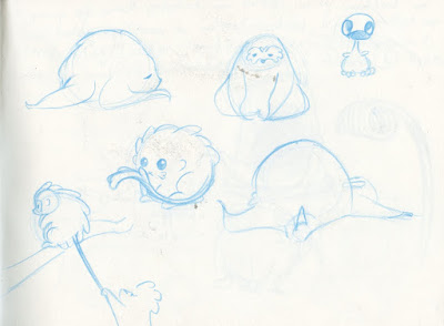


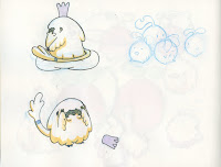
With the flute bearer it became really easy to design the character because i had a set style and look to the monkeys.


Once i had all my assets painted i moved onto my background, i decided to make sure that the background was full or else the monkeys would get lost in the whites of the background because of their fur colour.

The paper was stretched and then i painted on in water colours making the flowers and plants much bigger than the monkey due to the idea of smaller being cuter. I kept the majority of it green with only a few accents of colour to make it jump a little other wise i would of done it purely green but this makes it a lot more interesting.
Then came rigging the characters but by this time i only had a weekend left and so had to make the snap decision to make a walk cycle with one monkey which i was really disappointed about as i wanted to show the characters interacting with each other.
I became quickly reminded of my ineptitude at rigging when i tried to rig my monkey because of his shape he doesn't have a clear bending spine or neck attaching his head to his body so the DUIK software was struggling to make sense of what it was trying to rig i thankfully got help from Alex so my monkey was eventually rigged and ready to walk.
https://vimeo.com/201490965
This is the link to my video

Loop de loop is a contest that has a monthly (some times bimonthly) theme where are prompt word or theme is established and from there an animation, preferably looping, is to be created. I had mixed feelings on this theme as it was both a very easy and simple theme but quite difficult because of the wide breadth of what could be deemed cute as its something that is quite subjective.
I knew i wanted to make it using after effects to get some much needed practice in the area.
I started by searching the words 'cute' and 'kawaii' on pinterest to create a mood board (kawaii is the japanese word for cute and some how brings up very different results (?)) Cute gave me mostly baby animals and kawaii gave me more illustrative images. Its easy to just have a stereotypical cute animal to do something e.g. kitten puppy, so i kept looking for something i thought of as cute but a bit different.

I was able to find a photo of a baby snub nosed monkey. which was essentially a fluff ball. It was a bit different and had a cute appeal to it that really drew my attention, so i started designing characters based on this monkey. I also included features of the sloth as i find a sort of dumb cuteness to them.


I focused to keeping to round edges as they are what are commonly attributed to cute characters so i rounded out the monkey/sloth to make him appealing and squishy looking.


While following a random chain of photos e.g. Cute monkey nature plants bugs ants, I found this photo of ants trying to climb onto a spiral plant. I found the imagery of multiples attempting to succeed something made me consider the monkey in a group or holding the spiral plant so i did a small sketch and it looked like a flag bearer in a parade which i really liked so i started coming up with multiple variants of the creature so that they could belong in the same scene as performers or paraders.

I chose to make them really small as well so that their itrems are made out of twigs leaves and small objects because it offers a hand craft feel to them and also accentuates their size and vunerability.


the original story plan i had was to cause the parade to crash into oneanother and caiuse a pile up, scramble to get back in place and repeat all because the baton holder fell over. The baton holders design was more scruffier at first which was nice but left his fur to be too unpredictable and uncontrollable so i took it further and cleaned up trying a few variants on the style.


I used watercolours as they were softer colours which are more cute and less harsh than stronger colours.

After sketching some action poses i began sketching the other characters including a flute player flag bearer and a king being carried.


With the flute bearer it became really easy to design the character because i had a set style and look to the monkeys.


I put the radish characters in so that their brighter colours would break up the amount of white in the scene. With the poses i used them as an oppertunity to try out a few different colours, i went with purple as they are the complimentuary colour to the gold yellow of the other monkeys.


With each character I wanted to make them have a unique walk cycle but i started to see how my time was running out sadly. so i quickly sketched out the side profiles of of my characters in sections so that they could be rigged in after effects, i chose to leave out the outline as it was to harsh and overwhelmed the lighter colours.


Once i had all my assets painted i moved onto my background, i decided to make sure that the background was full or else the monkeys would get lost in the whites of the background because of their fur colour.

Then came rigging the characters but by this time i only had a weekend left and so had to make the snap decision to make a walk cycle with one monkey which i was really disappointed about as i wanted to show the characters interacting with each other.
I became quickly reminded of my ineptitude at rigging when i tried to rig my monkey because of his shape he doesn't have a clear bending spine or neck attaching his head to his body so the DUIK software was struggling to make sense of what it was trying to rig i thankfully got help from Alex so my monkey was eventually rigged and ready to walk.
This is the link to my video

Subscribe to:
Comments (Atom)