With Nenah and Kats research we went with a focus on using bright colours to catch the eye of young people, to break away from the gloomy classical tones applied to the Royal Opera Houses current campaign, using the colours in an up to date jazzy and illustrative or graphic look instead of using photography. With the style decided upon we also wanted to use the medium of animation to add a layer of mystery to the ballet and opera house. All the posters use photos currently clearly explaining and showing how the ballet will look and this generally meant a woman in a tutu and men in tights something that the royal opera house stated was a stereotype they wanted to break away from. So by using the simple shapes and animated stings we get across the idea of ballet without directly telling or showing what to expect leaving more mystery and a bigger emphasis on the public actively truing to find out more.
We wanted to make finding out more, with the times as well which meant we decided to create an app. This meant our focus went into designing the app, animating the dancer and creating posters to use in our campaign.
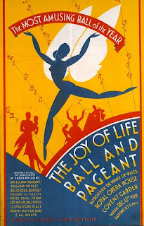
Our main inspiration came from a 1929 poster of theirs that made use of muted primary colours that stood out and were used in an illustrative style. While we were aware this would break away from the brief in the fact we'd be using a different colour scheme than requested we decided to go forward with the scheme any way because how campaign hinged on the usage of colour and animation to
bring a more lively and inviting look to the brand.


No comments:
Post a Comment