Saturday, 31 October 2015

Identify - Thought of You

Thought of you was an independent animation made by Ryan Woodward, it is a digitally drawn animation of a dance choreographed by Kori Watamatsu. I have always'd enjoyed dance animations and this animation is something I've always seen as something amazing. It shows weight and motion in fluid transitions with a sketchy aesthetic that comes from it being hand drawn (while digital).

Woodward wants people to look at and for it to cause thoughts on peoples current relationships, wether the relationship is good or bad he wanted it to cause people to think about it. For this he wanted to create an emotional response through the motion of the dancers, showing no facial features and using simple characters.

For me i was enthralled by the motion and the intricacy of the dance poses as well as the interactions between the dancers themselves and the story they tell, how this couple tell an untold love story which makes me think about how there was separation of death, but which one died is the question.

Friday, 30 October 2015

Apply - Secondary Inspiration Illustrations

These are illustrations of the photos in the previous post i plan on sung the upper halves of the clothes to see different styles of clothes but i plan to keep the dress fairly simple so that it will float in the wind.

Apply - Inspiration

As i was struggling with the clothes of the character i looked at female characters from animations by Disney, Ghibli and Dream Works that made use of long flowing dresses. And while i was going through the films i found films set in the 1920's-40s which reminded me of the war and of how the wars separated couples by having young men leave for war on the trains, so i decided to focus on the styles of those time zones.


I also gathered photos of the clothes from the 20s to the 40s These are all 40s clothes.


The images below are from the 1920s, i prefer them because they are much looser than the 40s clothes which are designed to be more fitted while the 20s clothes will be carried and flow more.


Apply - Initial Character Design

I started doing beginning drawings of the female character, so that it would be easy to animate i first drew a skeleton first and then a body over it, but this resulted in a head and body which didn't fit together, style-wise. the body looked too masculine and the dress wasn't nice.

I tried to alter the body to be more dough like so it looked softer and more effeminate but it looked too small in comparison to the head, the clothes also looked really dull and rigid feeling it was all very out of proportion.

The third version has no ideas or inspiration behind it keeping it just as boring so it needs some form of inspiration.

Apply - Initial Story Board idea

I decided to work with a story of separation, where a man was leaving a woman at the train station. The story is a sad one of longing between the two characters but nothing can be done for they are being separated by something greater than them, not just the train.
scene starts with the couple holding hands with the woman outside and the man inside the train, as the train starts to run the hands separate with the male moving off the screen, then cuts to a wide shot of the woman running as the train moves in the same direction but faster, and as the train goes off the screen the woman falls to her knees and cries in her hands as the wind carries away her hat.

After i have created my characters i want to refine the story and the camera angles, to add more drama and draw to the story.

Thursday, 29 October 2015

Apply - initial ideas

 The  below are mind maps making use of the themes we were given, after writing the centre word i came up with words which hold some form of relevance towards the word.

After doing this and considering which words i find the most interesting i liked the sound of separation, distance, desire and desperation coming from longing. They felt exciting and interesting because of the desperation and sadness they present.

Tuesday, 27 October 2015

Studio Brief 4 - Apply

Our new brief gives us the chance to make a 5 - 10 second animation using one of the animation techniques that we have learnt over the 'Explore' brief, which are; flip books, traditional, digital or pixelation. We are to work with one of these themes, Love, Hate, Surprise, Happiness, Fear, Lateness or Longing. We have 2 weeks to do this task.

Monday, 26 October 2015

Explore - Pose to Pose, Pendulum

We were given a small task to create a hand drawn pendulum that swayed back and forth across on a 2 sec time scope, so 12 frames a second, one swing per second, so that our pendulum is a ticking clock. We used animation paper and light boxes in order to create the animation, using three types of pencils to show what was what in the process. the red pencil was for the key frames, the darker blue was for the in-between frames and the lighter blue was for arcs and stuff that won't be animated.
The above is my first attempt, it has quite a violent swing which led to an inconsistent flow in which the pendulum quickly sped up as it reached the bottom in an unnatural manner it also resulted in the animation having only 24 frames and not 25 which was what we were required, this caused the pendulum to be out of sync with a ticking clock.
this is my second attempt, i relaxed the swing so that it would be easier to time and i worked with a much easier process of pose to pose starting with the starting pose the midway pose where the pendulum was at the bottom of the swing and when it was at the top of the swing, then added the in-betweens, to create the swinging pendulum, this time it used 25 frames (originally id added one extra frame between 13 and 14 resulting in 26 frames but after removing the 26th frame by moving all the frames along one coming to the right amount). This pendulum while better than my previous one was a bit more mechanical in motion when it came to its swing but it still showed the gradual slow in and slow out of the animation.

Explore - Pixelation, Final animation, Plastic Surgery

This is the final animation for the Pixelation task. While it was finished I ended up making many mistakes as well as forgetting my brief. My main problem was that i used the burst function on the camera (as you hold the button down it will take a constant stream of photos) which caused a very blurred line between film and pixelation. We were asked to do the photos in twos, so two photos for every frame, however i forgot this and used the burst function as my friends just did the actions because it was easier to get the action across to them. I did use the normal pixelation process for some parts on the animation but on ones instead of twos, one photo per frame, these scenes definitely fitted the briefs directions more concisely as it had the jerky appeal of pixelation but because i didn't have any way of steadying the camera the jerkiness was almost too much. Because i didn't put it on twos the speed of the  ones was too quick as well causing an inconsistent flow in the frames, because the burst caught so much information in a short period of time. In reflection it was a poor decision as it didn't fit with the requirements and it caused an unfortunate pacing which didn't feel like a pixilation. I thought that my story also didn't use enough of the concept of pixilation, which is the interaction of people with inanimate objects brought to life by the animation. In reflection i think the story could of finished on the close up of the face which was when the animation mostly used the burst feature. In some scenes i forgot to move props and people holding things would sometimes get caught in the shot so i also should of redone those shots and organised my set better. I also needed to cut out some scenes because i put the camera portrait and not landscape thus having to remove the scene where the infected eats the body and walks away, as well as the foot tripping. Another problem was when i started to do the pixilation, i decided to do it outside, where a bag floating through the wind would seem natural however it had began to rain which unfortunately caused me to have to go indoors, causing the bag floating through the air looked unnatural.

Unfortunately for a first try I'm disappointed in my self and personally want to redo the whole thing, following the brief properly but i don't think it will happen because i don't think anyone would be willing to wear the plastic bags as it results in sweat and almost suffocation, if i do get a chance to redo the pixelation i might have to rethink the way i prepare and come up with a different variation on the monster transformation, improving on the location and keeping my props out of sight.

Explore - Pixelation,Rendered story board

This is the rendered up version of my story board with stage directions, the story has pretty much been kept the same and the rendered story board includes more details such as camera direction, angle as well as actions the actors must do, it also includes a more specific design of the monster and parasite.


Explore - Pixelation, Costume Design

Before rendering my storyboard, i decided to create a couple of sketches to come up with how my person would become infected. I decided to use disposable items as it would be easy to clear up afterwards.

One was made of toilet paper which i thought would be easy to wrap around the body but i don't think it would be very secure, as toilet paper breaks apart very easily.

So i tried plastic bags which bunched up and could be spread across the body with a lot of tape, however again security is another factor as, if I'm not careful the bags could fall off.

The third variant i thought of was a combination of both the wrapping and the durability in the form of black plastic bag.however keeping it attached was the difficult part once again.

In the end i decided to use a combination of the black bin bags and the plastic bags mixed together as they are both the same material meaning they won't be too unnatural together and i can secure the plastic bags with the black bags (and tape).

Sunday, 25 October 2015

Identify - Death Parade, Ice Skating Scene

Death Parade was an anime that came out in Spiring of this year and centralised around a bar of limbo, so to speak, the Quin Decim, as it was where those who died went and were thusly judged on wether they would go to the void or reincarnate. Most of the episodes cover the lives of those who end up there to be judged by Decim and his assistant but along with this we begin to learn more and more about the recurring characters, I won't go into the story too much as what i want to focus on is a scene in the final episode so, SPOILER WARNING (i think), if anybody wants to go and watch it.

As i was unable to link the video of the scene Click Here to go to youtube to watch it.

In the final scene the black haired woman, (this is what she was known as before her name was revealed) does an ice skating performance as her memories before her death flash before her. What i want to talk about is the animation for the scene, in short and on a personal note i find it amazing. Specifically for the fact that dancing animations which feel alive, feel really hard to come by, especially in anime, most anime will create something more similar to an animatic where characters will shift across the screen in varying poses and sometimes not even that, stills end up being used which i find very disappointing as they don't show the enjoyment of the motion, speed and beauty of a dance. But with Death parades ice skating scene, they showed fluid dance movements and actions and poses flowed into one another. The animation gave the performance real life, with attention to the follow through of hair and clothes as they were pulled along, with secondary actions and anticipation building up into an amazing piece of animation. It is all helped by the background music that sets the stage for the character and builds on the performance giving it more depth and build up giving form to the dance movements creating something id say was one of the most unique anime animations id ever seen, (in comparison to all the action and adventure anime that I've watched). On a side note theres a short piece of dancing in the opening sequence which follows the same concept and feels just as smooth and fluid, also the opening is the most misleading thing there is, in a good way.

Im sure that there are anime that have done this before, maybe even better, but this is the best dancing in anime that I've ever seen if i had one thing i wished for it would be for there to have been more full body shots showing the whole body in motion from head to toe. I also hope that anime animation will continue to get better and the quality to improve like with Death Parade, I look forward to see how anime will evolve.

Explore - Pixelation Story Board


Once id finished my rough storyboard  i began to come up with a clearer idea of the story by making a posted note story board.
The first scene is an establishing shot from a low angle showing the two characters walking across the scene. i wanted a low angle to make the shot a bit more interesting as it seemed rather dull from a front on view.
The second shot is the introduction of the parasite flying through the air, i chose a forward facing shot so it blocked out the camera as it came closer giving an ominous feel.
The parasite then moves into a persons eyeball to causing them to fall back in shock, the other person also falls back in fear.


The person then falls with the camera angled above them as the parasite starts to spread along the body infecting the fallen friend.
The camera then zooms out and away as the infection covers the body, while the person is in pain.


The old friend backs away in fear slowly, then turns towards the camera and runs into it and past it.

running past the camera the body of the infected lies and is undergoing the transformation violently

It then stabilises while on the floor.


The infected stands up and the camera pans up the screen showing the transformation of the infected


Stops on the head and the infected turns its head around to sniff the air and takes a breath, sort of stabilising its body. Close ups on the infected's senses.
The eye swivels around in search of food and stops seeing some thing running in the distance, which is its friend


It gives an evil grin and rears back in preparation to launch itself after them zooming off the screen in a few short frames


Cuts to the old friend running and shows the monster in the distance, showing that they've put quite a distance between the two of them, but they turn to look anyway during a close up.


Shows that the infected has caught up with them and roars causing the person to scream and run away


But as they run they slip and fall, the camera focuses on the foot as they collapse face first onto the floor, in a mid shot showing the whole body.


In fear they turn around and scream raising an arm to protect themselves in a futile attempt as there infected comes in to cover the screen to eat. This all happens in one shot


A back view of the monster as they eat the body of their old friend. then the monster rises from the body and walks off screen leaving a corpse behind which starts to transform from the infection.

Thursday, 22 October 2015

Explore - Pixelation, Spider Diagrams and a Rough Storyboard


I started the Pixelation task by doing spider diagrams on each of the themes we could choose from to come up with some ideas. the themes we could choose from were; Lost and Found, Parasite and Host, Parent and Child, and finally Prey and Predator. These themes all have a running theme of interaction, and wether this interaction is positive or negative was down to me.

I chose to combine Host and Parasite with Prey and Predator as they had very similar themes to each other falling into destruction and death.


After going with the themes of Host and Parasite transitioning to Prey and Predator i started drawing out a rough sketch of the story line that could happen. The overall idea is that there are two people and one gets infected by a virus and turns into a monster as the other runs away, but fails to get away and ends up being eaten by their old friend and turning into a monster themselves.

Explore - Pixelation

Our second study task was called pixelation, which isn't what you might think, i.e. its not the pixelation of an image on a computer, its a stop motion that includes the use of human actors, so the motion of people is fairly jerky. It can generally be used for quite humorous situations and animations example being pes who do funny stop motions and pixelations using every day objects to create something else. ( i will do a more detailed blog post on them in the future).

Identify - 3D Printed Sculptures

This film shows 3D sculptures made using a 3D printer (John Edmark), spun at high speed which in turn creates the illusion that the sculptures are flowing like liquid. Now most would probably say its not animation but i feel differently about it, it reminds me of the zoetropes which were spun in order to make an animation which is what this is, its a 3D zoetrope. Animation doesn't have to be on a screen or a flat image as stop motion works with 3D models and moves on to 2D, flip books are a type of animation and aren't on screens either, animation is making something move and come to life which, spinning these models, does.

I really like how the models animation moves so smoothly and subtly as if you could dip your hand into it, giving a sense of wonder to it adding to the illusion that is seen. I also like its simplicity, wether its because it had to be that simple for the illusion to work or it was an aesthetic decision, the artist and mathematician looked to the natural world to bring this fantasy to us.

Sunday, 18 October 2015

Explore - Flippin' Eck Flip Books

These videos show the flip books that i have made over the past week each one has been an improvement upon the last i feel.
the above flip book is my first attempt and we were asked to make a bouncing ball and in future flip books improve upon it and develop it into something interesting. For the most part it turned out quite well but it was difficult to do with a limited number of pages (20) so making the ball gradually bouncing to a stop was a bit impossible.
So in my second attempt i made the ball look like it was being launched and ricocheting off the sides of the page at high speeds, this looked alright but again the page limitations and i don't think i had gotten the hang of squash and stretch as well as the timing and spacing of the balls travelling.
After the previous ones squash and stretch attempt i had gotten frustrated and decided to make a solid steel ball, with it while i had to get the timing and spacing right for the fall i didn't need to worry about squash and stretch. I enjoyed drawing this one as i could add a hint of humour to it when it hit the ground, breaking the ground.
Continuing with the solid ball theme i chose to make a cannon to fire my solid ball shattering it  upon impact, this one worked as a quick flip book to show the speed and impact of the ball shattering but i would of liked more frames to have given the cannon some anticipation and build up before firing as well as the smoke to have vanished and the ball fragments to have settled.
Im not even sure what happened with this one... I started by wanting to make a bird fly around but it quickly became a crazy bird call where the birds beak and eyes took on an insane amount of exaggeration, this was just really to try something different to the bouncing/solid ball id been drawing so far.
I wanted more time to put into my flip book and create smoother animations so i used posted notes. With the extra pages i was able to create a ball bouncing across the page with a much smoother bounce and get the squash and stretch right.
This final flip book is another bouncing ball but with additional material, it was fun to add the material because it gave the bouncing ball a new element id not done in my previous flip books, a secondary action. I had to figure out how much the material would fall and rise once the ball had reached its lowest and highest point, giving me a chance to try a bit of overlapping action and follow through.

Saturday, 17 October 2015

Identify - The Maker

The Maker is an animation made by the company Zealous Creative, a stop motion company.
The maker is a story which makes use of vivaldis four seasons, winter. The storyline is basically, a doll is born into a small workshop with no understanding for why he is there and what he needs to do. After finding a small book with information as well as writings on the wall, a sand timer begins to run starting the count down to the end. The doll begins to make a face and body similar to its own but with some slight differences, and once it was made he still had a lot of time left and was confused as to why the doll hadn't come to life. Then it notices a violin hanging on the wall and begins to play along with the films music. This playing brings the second doll to life just in time to see the first doll vanish and watch as everything resets itself back to where it was and restarting the music.

Visually The Maker is a beautifully animated film which makes use of small hand made props to create the old work shop. With tiny hand drawn illustrations to go into the books and on the walls of the scenery. The characters, the rabbit dolls, are called dust bunnies and were created by artist, Amanda Louise Spayd, they were originally made merely as ornaments and not stop motion dolls but Zealous Creative wanted to make them move to give them life.

Its because of its aesthetic and the use of Vivaldis Winter in the back ground that i find the film so appealing, while it could have a meaning behind it i like to see it as something just to be enjoyed, but it does leave many questions; when does the making stop, if ever? when did it start? and how long has it been going on for? These are questions i don't have an answer for and so i choose to enjoy the film for its mystery and wonder.

Tuesday, 13 October 2015

Explore - Flippin' Eck (side brief)

This side brief looks at the usage of flip books in animation. We were asked to produce flip books which make use of the various principals of animation; specifically Squash and stretch in a ball bouncing animation, timing and spacing. We are also asked to try other animations once we've gotten used to the flip animation and then develop further adding character to our animation.

Telling Stories - The Walking Dead Storyboards

My final storyboards are from the walking dead series, purely for a series that i enjoy to watch. While it may not be animated the series is a fantastic piece for narrative and storytelling, they present intense pacing and exciting action which gets really engrossing.
The difference between story boards for live action series compared to animated shows is that the illustrations and storyboarding won't be similar in style to the end product, a lot of varying differences will appear in the final product to the storyboards. the characters obviously won't look like the actors and the scenery will be different as well as the backgrounds and extras. There seems to be more detail in comparison to animation storyboards but less lighting and shading due to the minimal control on things such as natural lighting.

The 12 Principals of Animation

Walt Disney and his team of animators created the 12 Principals of Animation in the 1930's, and were created to try and convey the life and personality of the characters. Before the 12 Principals of animation, there were good animations and they were created not only to improve on Disney's Animations but to help explain what the animators were trying to show.

1.Squash and Stretch
This is the first principal which looks at the material of the object. The main example used is a ball bouncing, example is if the ball stretches as it falls and then squashes out once it hits the floor then its material is closer to something like rubber while if there is no squash or stretch the ball is more solid like ceramic or steel.

2.Anticipation
This covers the expectations that come about from the audience in response to what there expectations of what will happen in the animation. Example being a character will do an action in preparation for another action.

3.Staging
This is the presentation of an idea and is the part which is communicated to the audience. It should communicate the character/objects mood, attitude or stance in the story's current situation. Staging also directs the audiences attention through the use of camera angles and the character being the main focal point and not being up staged.

4.Straight ahead and Pose to Pose
These are two styles of working in animation both with pros and cons. Straight ahead is as it says, straight into it animation which means drawing out the animation frame by frame, while it gives the animation more fluidity and it allows for more freedom of the direction you want to take the animation, however it can result in warped and inconsistent sized animation. Pose to pose however works in a much more organised manner making use of key frames, which are key points in the animation and then the animation is tweened, (adding the frames in between the key frames). This method givens the animation process a time as there is a definite start and end, but it sets the animation in a scene with not much room for change.

5.Follow Through and Overlapping Action
Follow through is the termination of an action, or the end, while overlapping is what happens after the termination of one part of an action. An example would be a persons head, while a head moves back and forth the hair will follow after it and once that head stops the hair will swish back and continue on.

6.Slow-Out and Slow-In
This makes the animation seem more life like, everything starts with a gradual increase in speed and the action will stop with a gradual slow down. A standing pose doesn't immediately go into a high speed run, theres a gradual increase in speed until it reaches its terminal speed as well as a build up.

7.Arcs
An arc is a swinging or curved motion that most, if not all animation movements use, its generally used on characters as it gives more life to the characters animation, other wise it can look robotic if the arcs are not in place. Arcs are used in nearly all motions and cycles.

8.Secondary Action
A secondary action is an extra action that reinforces the first action or is an action that happens alongside the main action.

9.Timing
The more drawings used to make an animation means a slower action while the less drawing will result in a faster looking animation. The second part of timing is wether or not the animation is done in twos or ones. Twos is when there are two drawings on a frame and ones is when theres a single drawing on the frame. Timing also gets across the characters actions, so if a character moves there head quickly its a twitch or a dodge, but if its slower with more frames its a nod or come over here.

10.Exaggeration
This doesn't necessarily mean to enlarge and exaggerate the features of the character but to make things such as simple actions more interesting. By making a character do more emphasises the actions and secondary actions, so instead of just being shocked and saying something you make the character do an exaggerated leap back and wide eyes to show shock.

11.Solid Drawing
Solid drawing comes down to drawing skills and putting life into your animations, so symmetrical characters look very wooden as there isn't much variation, so more asymmetrical characters have more life.

12.Appeal or Character Personality
Making sure a character has charm and is appealing, this doesn't mean making them visually beautiful but more enjoyable to watch and listen to.


Monday, 12 October 2015

Studio Brief 3 - Explore

Over a period of weeks we will cover various types of animation, flip book, pixellation, frame by frame and pose by pose. I will be exploring these types of animation and learning how to do them as well as develop an understanding of them. Along with these animation techniques we will look at the 12 principals of animation by disney and explored and worked with.
Sunday, 11 October 2015

Telling Stories - Wicked Animatic

This animatic was drawn by Heidi Gilbert, who wanted to see 'Wicked' (the musical) could be turned into either a live action film or an animated feature, so she created a storyboard and animatic for the musicals big number, 'Defying Gravity. The scenes were simple but expressive and really showed the friendship between Glinda and Elphaba. Compared to the other storyboards I've seen which I've only seen as storyboards this one was presented as an animatic along with sound giving the story more life and excitement i can really understand and see how an animatic changes the view and feel of the story and makes it feel more like an animation and gives an idea of how the storyboard artists want there story to be shown.

The animatic is below on the link.
https://vimeo.com/19733014

Saturday, 10 October 2015

Telling Stories - Final Storyboards

These storyboards are the final drawings rendered up to a higher quality. i added light and shadows in block sections over a more gradual gradient because i can't produce smooth shading nor did i have the time to create such shading. however because it is in block colours it was a lot easier to show the shadows and where the light falls. The only light source in the story came from the moon so i had to make sure i remembered where the position of the moon to the characters was. As the shading was grayscale i used red to mark out 'stage' directions so that they were clear.

I found that what i forgot mostly was the cats bag and the money, so after the drawings had been done i added in the forgotten images. i think what was the most difficult thing to draw was the boat as trying to understand which of the angles it fitted in. 

 My favourite images are the first and sixth images below as they work with angles I've not used before as well as the dynamic lighting and the large shadows.


Telling Stories - Maxime Rebiere Wings of Courage


 Maxime Rebiere (missing some accents on the e's as i don't know how to add them) is a french illustrator and storyboard artist who has worked on many (mainly french) movies. The images here were drawn for the movie storyboard, 'Wings of Courage', the director for the movie, Jean-Jacques Amaud, asked him to work with colour to create a more realistic, movie feel resulting in a gouache piece of work.

As pretty much all, bar a few lines of colour, storyboards I've seen so far have been grayscale or line, its interesting to see the colour panels and i think they work really well as images and falling under the title of concept art as well as showing what the director had asked for but if they were for an animated film and were kept as rougher, rendered sketches i think they would have left much more freedom for the animators due to the lesser/minimal details in each panel, (however i know that this wasn't an animated film so its rather irrelevant, and that the director specifically asked for painted storyboards anyway.)

Telling Stories - Initial Story Boarding

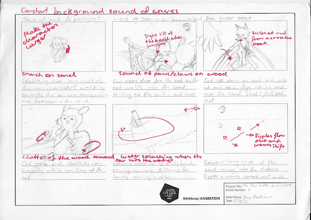
These are my initial drawings of the story boards, along with my sketches i add the 'stage' directions below, action directions on the panel, sound underneath the panels as well as notes on changes that i want to make on the final story boards.
There were a couple of changes i wanted to make on the first two panels; the characters were too small on the first one which doesn't show enough detail on the characters. With the second panel the boat is a little odd, i wanted to try and get the idea that the boat was a beautiful pea green boat so i added the orbs to look like jewels but it looked really odd as it didn't make it look 'beautiful' in the slightest so i dropped it in all the future panels.
In this storyboard, in comparison to the previous that needed changes after they were drawn, the forth image was changed from the original rough sketch, i zoomed in on the bag for an extreme close up which removed the owls jumping in shock from the scene and focuses entirely on the bag being opened. On the fifth frame is all the same except for the owl now jumps in response to the previous scene on this frame and then starts rowing because i wanted the owl to be a little embarrassed and concerned that he might of been seen day dreaming.
I want to alter the sitting position of the cat in the first scene and tilt her head either up or down to show more of a struggle and strain to open up her honey, swaying tail with ruffled, spiked hair. several scenes are missing the cats bag and the money that they took, so that needs to be added in.
As there are only two scenes on this story board there weren't any scenes i wanted, needed or had to alter or change.

Friday, 9 October 2015

Telling Stories - Character Design and Development


 Before using drawing up the rough storyboards i did some secondary research into the shapes of owls and cats along with the anthropomorphism of the animals in the films to create my characters. i used graphite sticks, ink brush and pencils as my media. i found that owls generally are more rounded in shape bar the beak and horns (on a few owls) while the cats felt very sharp and slender in comparison, so i decided to focus on making the owl a round character while the cat is more of a sharp and pointed character.

 
I was quite happy, and enjoyed doing the characters for this, it was brief and i didn't create any varying poses but i liked how i got to my final designs in a few sketches. I also liked writing up all the information on my likes and dislikes about the designs.

Telling Stories - The Legend of the Guardians Storyboards


The second film i watched was the legend of the guardians a film which featured owls as there main characters. The CGI for this film is incredible, I've never really been a big fan of CGI, personally, (comes from being freaked out by it as a child I found the 3D cartoons odd) but the CGI in this film is beautiful. While still obviously being animated it looks like it has life, the animation isn't rigid or janky but smooth and flowing. Everything that moves has a reason to move giving the movie real life and vibrancy.

I unfortunately didn't find much of the storyboards except the above. The storyboard artists were; Simon Ashton, Kelly Baigent, Noel Cleary, Jonathan Dower, Arthur Fillow, Chris Georgiou, Scott Hurney, Adam Murphey and Marc Wasik. The storyboards i found were drawn digitally, which were a lot more scratchy and detailed than the old aristocats storyboard with smooth shading, showing varying light and shadow, along with detailed backgrounds.